03.3Brand guidelines v1.0 / Enduro Group3 sheets
Al-Bab Initiative
A field programme run through business as a means of access, for the non-profit G.A.P. The design problem was to look like serious infrastructure rather than a campaign — something built to last in a difficult place.
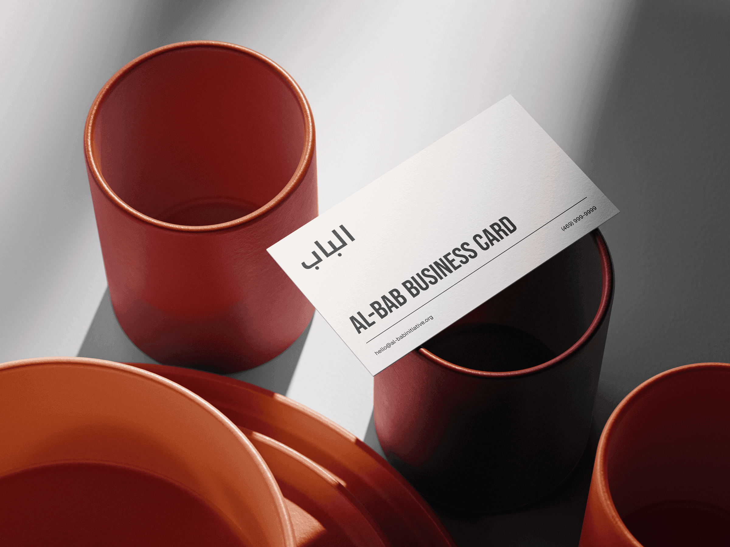
The bilingual mark at business-card scale
Sheet 1 of 3
Sheet 1 of 3. The bilingual mark at business-card scale
- At a glance
- Field programme of the non-profit G.A.P. (Global Allied Partners)
- الباب — al-bab, “the door” — set in Noto Kufi Arabic
- Two audiences at once: field practitioners and supporting churches
- Serious infrastructure rather than a campaign
- Deliverables
- Brand guidelines
- Bilingual logo system
- Stationery
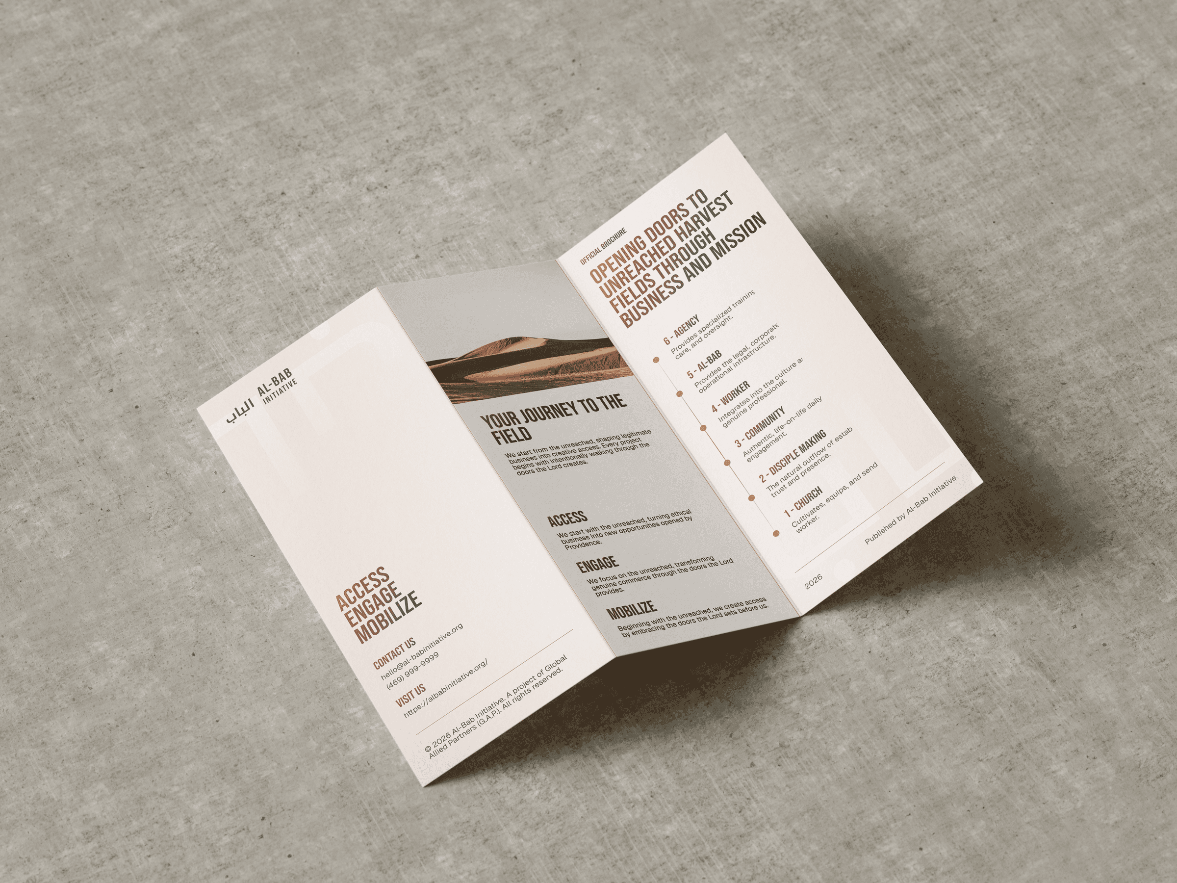
- Tri-fold brochure
- Posters and signage
- The Brief
- Two audiences the system has to hold at once. Field practitioners and partner organisations need dense operational detail to stay legible and credible; supporters need the work to feel grounded rather than promotional. Neither is served by a brochure.
- The Direction
- The brand’s own metaphor is a door, so layouts open: generous ground, one idea per surface, and when a composition feels crowded the fix is to remove rather than rearrange. Bebas Neue set solid and flush left at scale, hairline rules instead of cards, near-black ink, and copper strictly as emphasis — a surface where copper dominates is off-brand however handsome. Exactly one flourish is allowed per piece: the gradient headline, once or not at all.
- A Trap Worth Recording
- Bebas Neue ships a single weight, but h1–h6 default to bold. With no bold face the browser synthesises one by smearing the outlines — heavier, cruder, and it passes every check that only reads the stylesheet link. The system pins font-weight explicitly and sets font-synthesis to none.